13 Ways to Make a Small Living Room Feel Bigger

Wish your living room were 50% bigger than it is? With a few design tricks, you can make it feel bigger than it is. Try these tips to tweak your colors, furniture, window treatments, and more to make your living room look and feel bigger!

public.jpeg

1. Use plenty of light colors.

You’ve probably heard that painting your walls white or another light shade (like soft grey or subtle taupe) can help a room look bigger, and that’s definitely true, but you can make this effect even more powerful by using similarly airy shades for other furnishings as well.

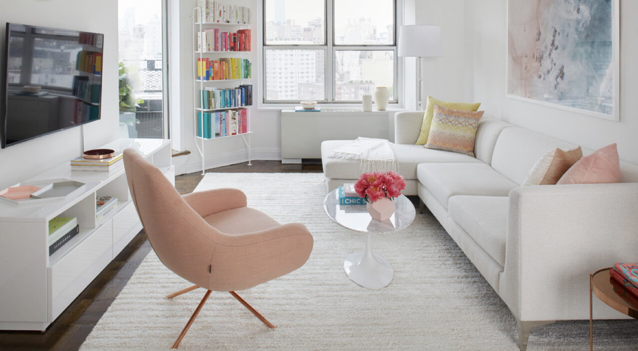
The living room shown here includes a white rug, white sofa, white TV console, and white coffee table (among other things), which together help create a seamless and breezy look.

public.jpeg

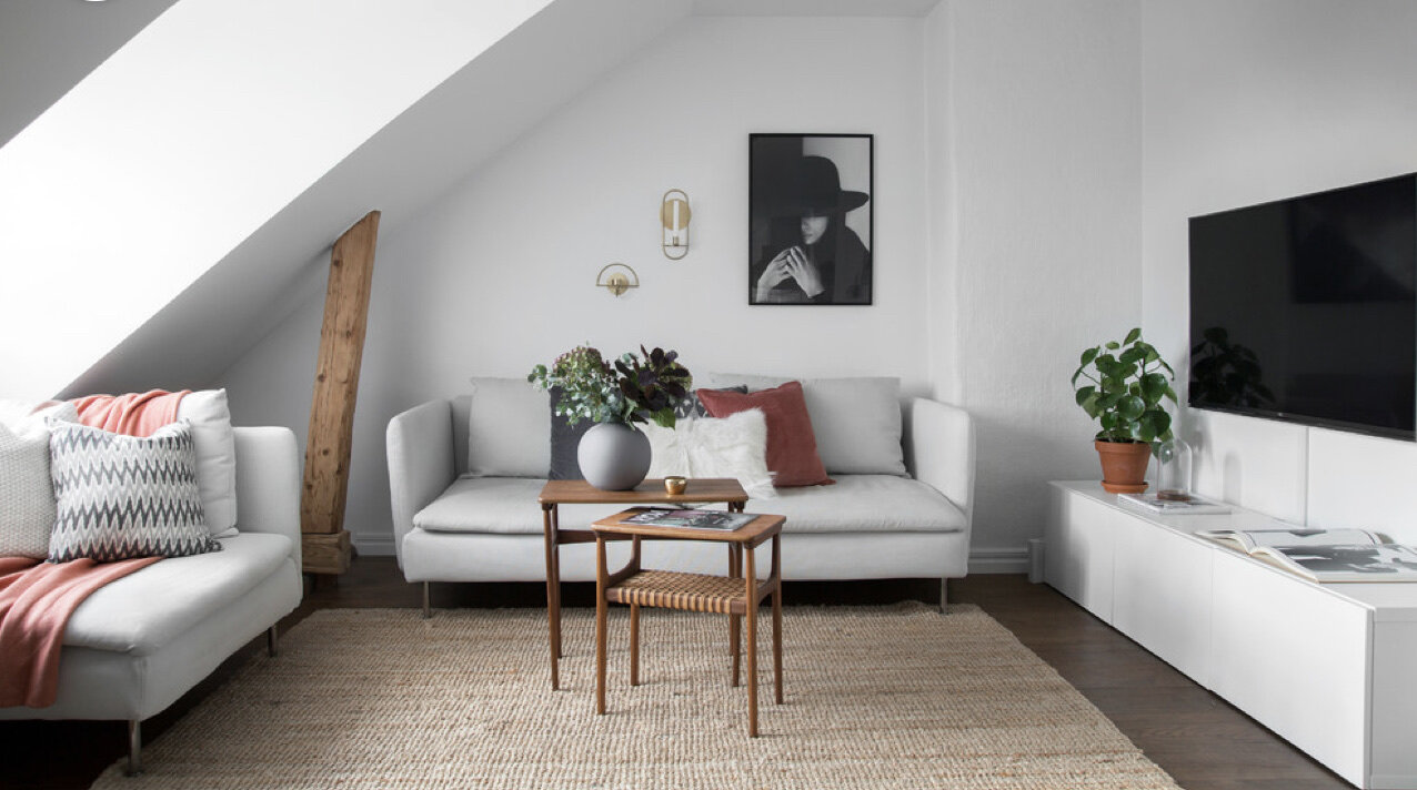
This method doesn’t have to be as impractical as it might sound. Seating with removable covers, hard surfaces in white, such as white laminate media units or marble-topped tables, and hardy natural fiber rugs in pale shades will give you a light color scheme that doesn’t feel impossible to keep clean.

In general, choosing some major furnishings in a pale shade similar to the wall will help avoid breaking up the living room, but you don’t have to choose everything in white to benefit from this effect.

public.jpeg

Don’t think you can live with a white sofa? A mid tone grey is an excellent shade for hiding all types of blemishes because it won’t immediately show light or dark flecks, like stray hairs or lint.

public.jpeg

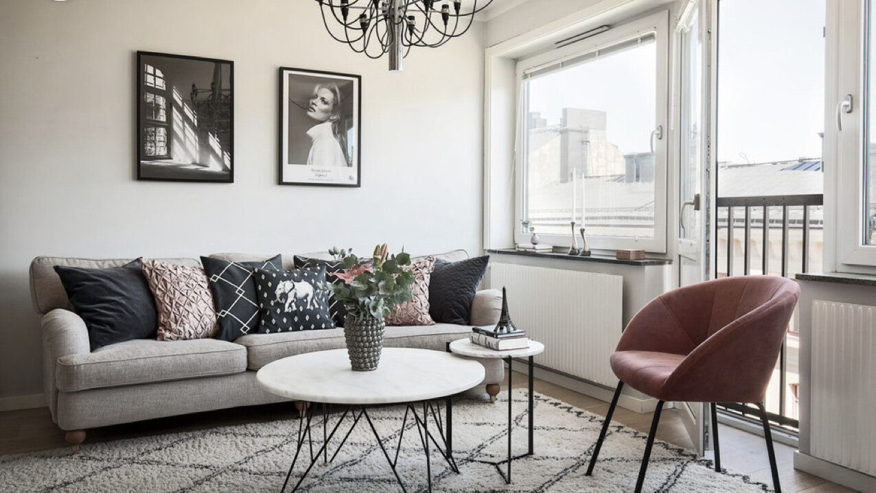
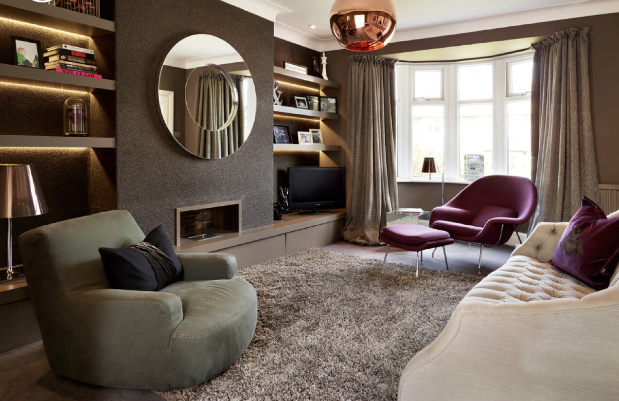
2. Include hints of dramatic black.

Just because you’re using a lot of light colors doesn’t mean you can’t add a little drama. Introduce small elements of black to give your living room a strong senses of contrast and therefore interest. Black-and-white patterns especially add just the right hint of black to energize a small room without shrinking it, as do black-and-white photos or art pieces.

Adding some contrast actually creates an interplay of depths, with different pieces advancing and receding, and this can trick your eye into seeing the room as a bit bigger.

public.jpeg

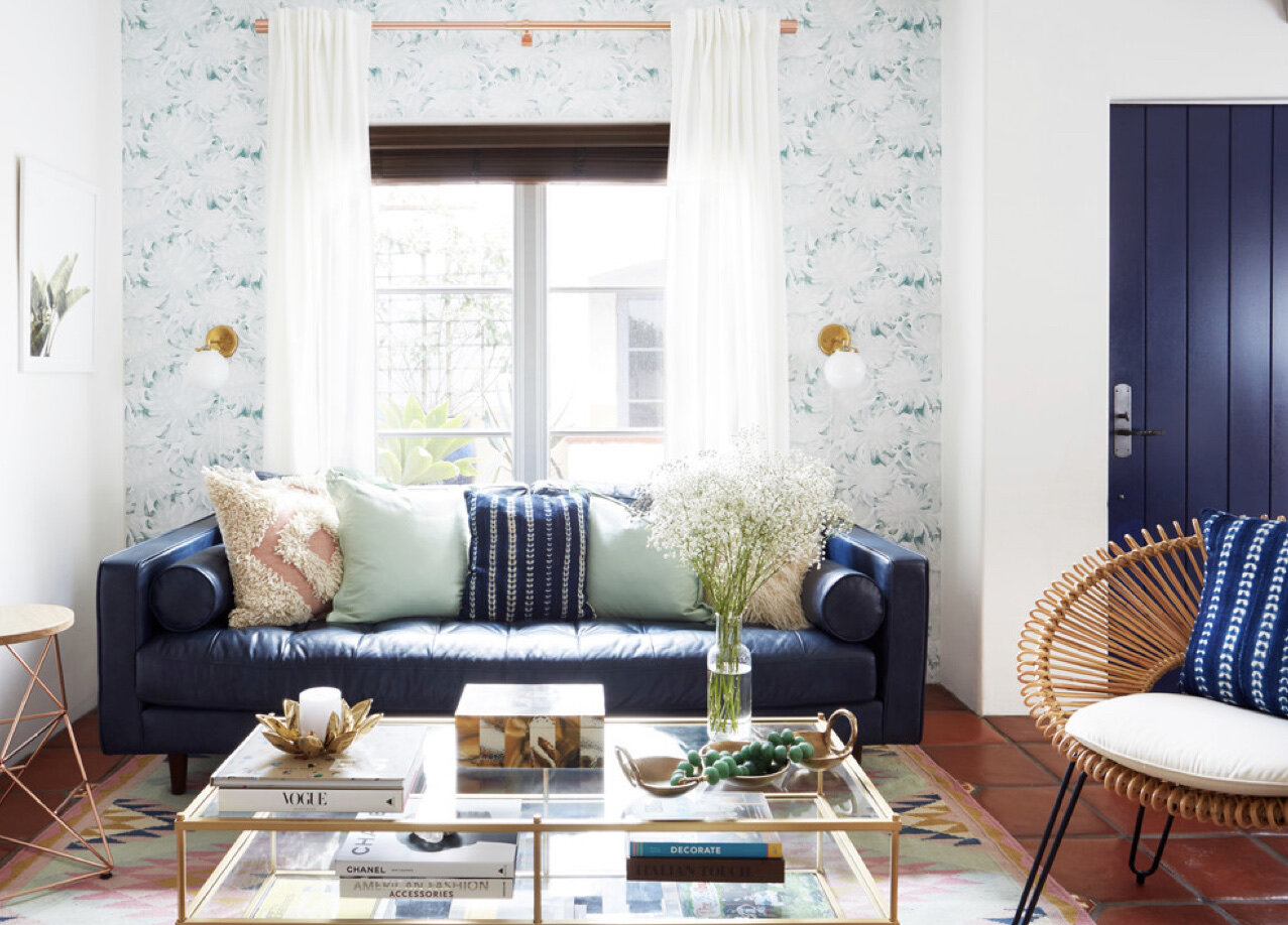
3. Layer a feature wall.

Speaking of playing with depth, if you want to add an interesting feature wall, consider doing it on a wall with a window and layering the dramatic treatment behind a light colored curtain. The wallpaper feature in this room looks a big farther away because it’s tucked behind the dimple white drapes, and that makes the room seem deeper. It also gives a visual break that keeps the paper from appearing too busy.

public.jpeg

4. Use soft sheers.

For window treatments in the living room, soft sheers are often a great choice, assuming you don’t need absolute privacy. Curtains that aren’t completely opaque let your eye take in a hint of the view beyond, which makes the room feel less closed-in when the curtains are drawn.

public.jpeg

If you want total privacy sometimes, or to be able to shut out the outside light, you can also layer sheers behind opaque panels to have both options. Choosing similar shades for the two will help them visually blend together for a seamless effect that feels big and not busy.

public.jpeg

5. Uncover your windows altogether.

Privacy not a concern in your living room? Consider leaving the windows uncovered. It removes one more element that breaks up the room, saving a precious inch or three of space and leaving the outside view fully exposed, which draws the eye outward.

public.jpeg

6. Include lots of lighting.

Natural light goes a long way toward making a living room look bigger, but artificial lighting helps too. Include plenty of light sources to create a big and bright look during the day and a more selective and cozy glow at night. Include lights with dimmers when possible, and try to use lighting form at least three categories, such as floor and table lamps, hanging fixtures, recessed ceiling fixtures or wall sconces.

public.jpeg

7. Draw the eye.

Here’s a clever trick: Sometimes the best way to make a room seem deeper is by drawing the eye completely outside of it. This living room doesn’t include any feature wall treatments, but the eye can’t help but land on the fun wallpaper print in the adjacent bedroom. Placing that feature wall where it could be seem from the living room cleverly adds some interest to both rooms while making the living space feel less confined.

public.jpeg

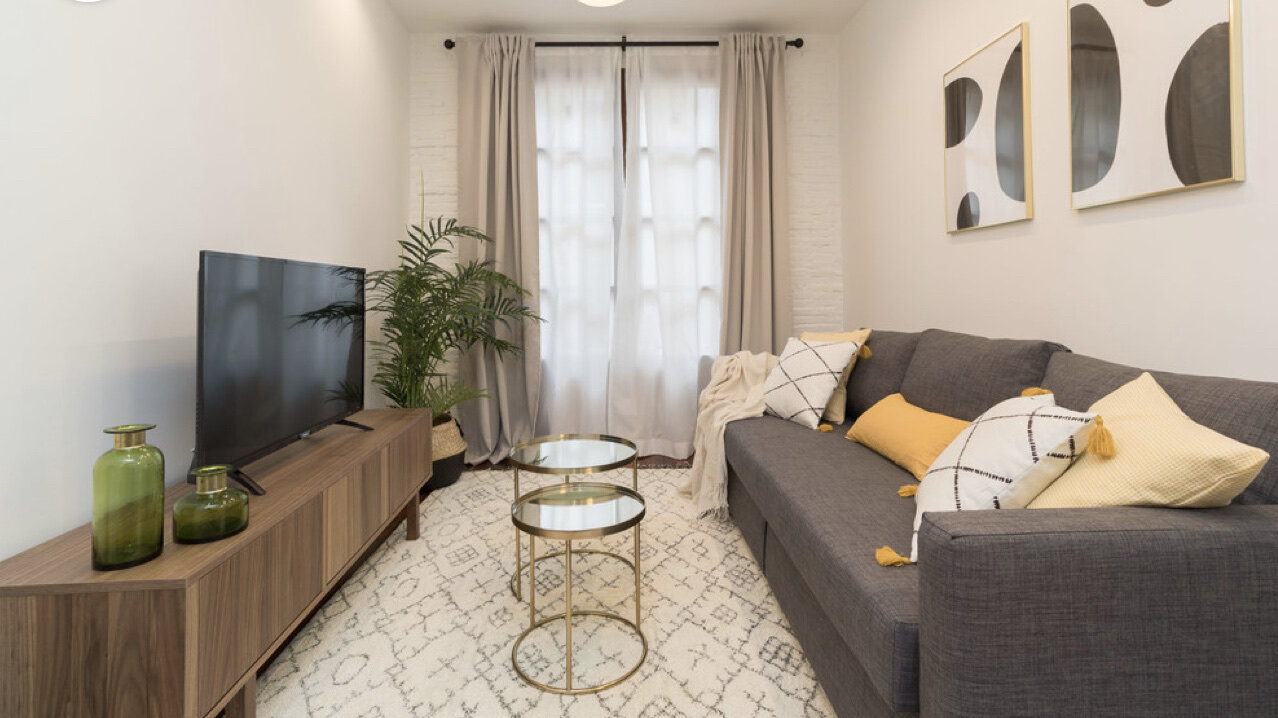
8. Use a generous rug.

Rugs can be great for defining a specific zone as separate from its surroundings, such as anchoring a seating group in an open-concept space. However, to make a small living room look bigger, you don’t want to break it up, but rather highlight a long stretch of floor.

Use a generous rug that comes close to the borders of the room to add richness and draw the eye in different directions.

public.jpeg

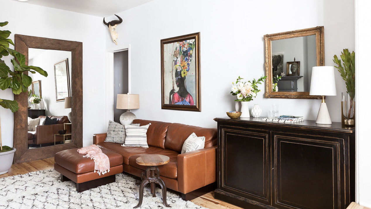
9. Make use of large mirrors.

Adding mirrors can seriously fool the eye into thinking the room is twice as large, especially if you use one big enough to appear almost like a door or window into another space. Look for floor mirrors, oversized wall mirrors, or even stretches of mirror tile to create the illusion to maximize effect.

public.jpeg

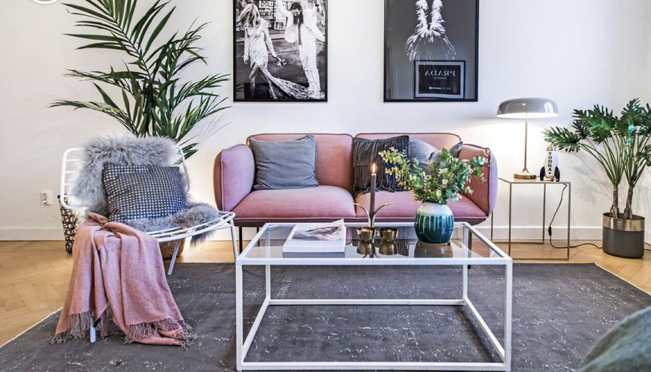
10. Use minimalist tables.

In a small space, you can only eliminate so much furniture. After all, what use is a living room with nowhere to sit?

But one place you can reduce your bulky furniture is the coffee table. Use a leggy table to make the living room look bigger and allow you to stretch your legs a big more, which help the room feel bigger too.

public.jpeg

This trick doesn’t just apply to your coffee table. Use a sofa, chairs, and side tables with long legs and a less bulky silhouette to create longer light lines and give you more leg room too.

public.jpeg

11. Skip the coffee table entirely.

Want to be truly bold? Skip the coffee table and rely on side tables and ledges for setting down drinks and other items. Leaving out the table in the center of a seating group instantly makes a living room look and feel much more spacious. Besides, often all you really need is one good footstool anyway.

public.jpeg

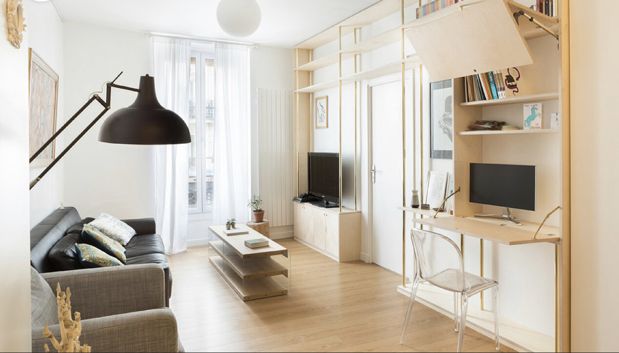
12. Use open shelves.

While living with less is always a great goal, sometimes you just need some extra storage. Include some open shelving without closed-in sides to stash visually interesting pieces without boxing in the room, so you don’t feel like you’ve lost 25 to 50 centimeters of space.

public.jpeg

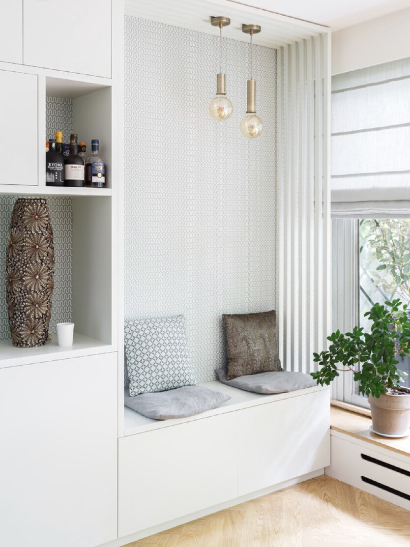
You can make your living room storage do double duty by turning drawer units or a chest into a bench. Just make sure your storage piece is sturdy enough to hold a person’s weight.

public.jpeg

13. Include multiple focal points.

Ultimately, you shouldn’t be scared to include some pieces that add drama and personality to your living room, even if they break up the walls and don’t create a perfectly seamless and minimalist optical illustiion. Including multiple medium-strength focal points instead of just one singular feature, or none at all, encourages the eye auto move around the room so you can take it all in visually.

Reconfigured Kitchen Goes From Bland to Glam

Before being remodeled, this kitchen was blessed with an ample size but cursed with a difficult layout. Because the sink and cooktop were directly opposite each other, whenever two people were working there they ended up doing an awkward version of that disco classic, the Bump. It also came up short in the aesthetics department. “It was if someone had purchased 50 plain brown cabinets and lined them up along the walls,” says Melinda Mandell, the interior designer. The family who lives in the house likes to entertain, so the kitchen is party central. Mandell’s challenge was to remake the kitchen so it would work well and look good too.

Location: San Francisco East Bay area
Size: About 430 square feet
Designer: Melinda Mandell

Screen Shot 2017-04-01 at 10.14.54 AM.png

The designer started by reconfiguring the layout, taking the range and the range hood out of the kitchen island and relocating it along the far wall. This freed up the island for food prep and eating. The refrigerator is now closer to the sink (to the left of it, just out of the photo frame), making for a more convenient workspace.

 Before Photo

 Before Photo

BEFORE: Looking at the pre-remodel shots, you can see that the function wasn’t the only aspect that received an overhaul. Not only was the kitchen an uninspiring brown-cabinet cave, but it had ungainly elements, such as a range hood that had a back end covered with cabinets.

AFTER: The new kitchen is elegant instead of awkward, with elements like a sculpted marble backsplash behind the cooktop. To create the curvy shape that was inspired by the bell-like lines of the range hood, Mandell sketched it directly on the wall for the fabricator to measure.

Backsplash: Grigio Italia marble, Da Vinci Marble; range hood: Vent-A-Hood

The creative angles have been carried into the lines of the countertop, where a series of “tabs” breaks out of the rectangle of the kitchen island. The squares are supported by legs and columns, giving the island and cabinetry an unusual architecture.

Countertop: White Princess quartzite, All Natural Stone; stools: HD Buttercup

Some of the columns are more than decorative. A series of them are pullouts, providing vertical storage for baking sheets and spice racks. The one to the right of the sink can be pulled out to reveal towel bars sized for dishcloths and tea towels.

Countertops: Cafe Royale granite, All Natural Stone

The columns and the cabinet molding give the room a classic look, which is in keeping with the home’s architecture. Mandell says she chose elements like a black and white color palette and the Sputnik light fixture over the island to appeal to the homeowners’ contemporary side.

Chandelier: Sputnik, Jonathan Adler

Before Photo

Before Photo

BEFORE: Two things are visible in this pre-remodel shot: The unconventional hood and a long desk area.

AFTER: The new desk has a wider cutout for chairs — two of them, in fact. “The desktop was nearly 10 feet long,” Mandell says. “That’s a lot for just one person.” Space for two chairs means both children in the family can do homework at the same time.

The valance is crafted with birch bark-printed fabric trimmed in green. “There’s a lot of beautiful greenery outside the windows,” Mandell says. The designer says that saying something brings the outdoors in is a quote often penned in design articles, but “in this case, it’s true.”

Valance fabric: Eric Cohler for Lee Jofa

The floor plan shows the big picture. The small room off the kitchen was once a butler’s pantry. Now it’s a home bar, outfitted with a bar sink and wine refrigerator.

In this area, the backsplash is an oversize glass brick. “We wanted to change it up in this area,” Mandell says.

In a way, this feature summarizes the new look of the space. No stodgy service area for this new kitchen — instead it’s a space where someone is just as likely to lift a glass as to stow a tray.

Tile: Kiss My Big Fat Glass collection, Alyse Edwards

15 Kitchen Backsplashes for the Adventurous and Creative Types

Not a fan of white subway tile? Don’t fret. Look to custom and DIY options for creative backsplashes that are only limited by your imagination and budget. Of course, you’ll want to take into consideration your cooking habits, too. Those who fancy themselves amateur chefs and tend to have multiple splattering pans going at once might not be keen on a custom photography backsplash. But for the pop-it-in-the-microwave types, the more decorative options might make sense. 

Here are 15 adventurous options that you — or your designer — may want to consider for your next kitchen backsplash.

Screen Shot 2017-03-31 at 10.47.07 PM.png

1. Photography. An original photograph or print backsplash can fit with any style — and what a statement it makes. Consider using a family vacation photo, a city image, or even a pattern design that fits your style.

2. Salvaged boards. This is usually an easy material to source, and works great for those looking to add farmhouse style. Add a muted, soft color to the boards with a diluted paint, as shown here, or go bold with a few coats of fresh, bright paint.

3. Vintage bottle caps. Bottle caps create an interesting look suitable for a kitchen with vintage flair. Plus, they come in many colors, so you can customize the caps to fit with the rest of your kitchen color scheme.

4. Snow skis. Like the really unexpected? Salvaged downhill skis are a fun choice for a modern and funky or lodge-style kitchen. 

Skis can be found at secondhand stores, garage sales and online. Coordinate the colors with your home or mix it up and add spice and a variety of colors with different skis. Fill in with tile pieces to make your skis go the distance.

Screen Shot 2017-03-31 at 10.56.50 PM.png

5. Reclaimed barn wood. Though this material might not be best for the space right behind your range, it works great for other areas, such as a coffee station.

6. Antique mirrors. Standard square mirrors found at any local hardware store work for modern or traditional styles, and add a reflective quality that can visually expand the size of your kitchen. 

If you’re not too keen on an overly polished look, try looking for aged mirrors with patina.

7. Magnetic chalkboard paint. There’s so much versatility with this option. If you don’t like the standard classroom look, you can customize your paint color and still get the benefits of having a magnetic chalkboard. 

Plus, it’s easily applied. A foam roller and tape are practically all you need.

8. Clothing buttons. A button backsplash has the right look for this cottage-style kitchen, supplying a mix of textures and colors.

9. Pennies. While the backsplash shown here is made of ceramic tile sheets covered in copper, there’s no reason you can’t use real pennies to make your own similar version.

10. Copper metal sheet. This material was a good choice for this rustic modern bar area, with slightly pounded features that give the metal a worn look.

11. Mosaic pieces from broken china. Pieces of china and tile set the tone for this cottage-style kitchen. China can be found at secondhand stores, estate sales and garage sales. To save money, look for chipped or otherwise slightly damaged pieces that are marked down, which are perfect for this project.

12. Sliced corks. Many of us have a drawer or container full of wine corks just waiting for a good use. As a backsplash, they add warmth and texture. They’re great for a bar area in the kitchen.

13. Stained glass pieces. These round stained glass pieces add a funky, unexpected touch to this casual cottage-style kitchen.

Select sheets of stained glass in colors that coordinate with your space. Cutting the round pieces does take time, so a smaller area like over the range may be the best location for this project. 

Tip: For a dynamic look, divide your backsplash into 50 percent 2-inch circles, 25 percent 1-inch circles and 25 percent ½-inch circles.

14. Wine crates. Salvaged wood wine crates also work great for a bar area. Call your local wine stores to see if they have any used crates you can pick up, or search online. Most boxes are not treated and can be stained to coordinate with other elements in the space. 

Tip: Be gentle when taking apart wine boxes, as they split easily.

15. Tin tiles. A tin backsplash has a classic, timeless look but adds just enough shine for a modern feel. Tin tiles comes in different finishes, too, so if you really want to go modern with this material, try molded plastic panels, which allow you to paint the surface any color. 

Modern Art Deco Bathroom in Ohio

Bathrooms are one of the most popular spaces to remodel, and the cost for these renovations can range quite widely. As part of our Reader Bathroom series, today we visit an Ohio couple who renovated their bathroom for about $24,000.

Bathroom at a Glance
Location: Cincinnati, Ohio
Size: 100 square feet
Total cost: $23,987
Construction time: 8-weeks

Before Photo

Before Photo

BEFORE: A 1,350-square-foot condo, part of a century-old industrial building that was converted to condominiums a decade ago. When the bathroom shower began to leak, causing the drywall near the bottom of the vanity to bubble out, it was time to renovate.

Other owners in the building had encountered the same problem, due to improper construction — the showers in the building had no shower pan or liner. “It was a problem just waiting to happen,” says one of the condo owners, adding that she had always intended to remodel. “The leak forced me to get an idea and a plan together.”

After Photo

After Photo

AFTER: The owner of the condo took charge of purchasing the supplies for the renovation, collecting them all before the project began. This helped the contractor schedule the plumbers and electrician. “No one ever had to wait for materials to come in,” she says.

The contractor had the workers take the room down to the studs. The plumber ran new lines for the vanity sinks, tub and shower. Because the bathroom floor sloped more than an inch, the tiling subcontractor spent quite a bit of time shimming the floor so it would be level for installing new tile. 

They selected classic white subway tile to line the shower and the wall behind their vanity. They chose a white quartz countertop, paying $1,200 for that and some matching pieces for the shower and tub curbs. Their frameless shower door features hinges and a handle in oil-rubbed bronze. 

Countertops: White Zeus Extreme Quartz, Builders Surplus, Newport, Kentucky; undermount sinks: Builders Surplus; shower fixtures: Ferguson, Cincinnati; shower door: Dickey’s Glass, Newport, Kentucky

Before Photo

Before Photo

Hiring a contractor helped in terms of anticipating its quirks. Their goal was to give the master bathroom a modern Art Deco look. They ultimately decided to keep the original layout to help keep costs down.

After Photo

After Photo

AFTER: They were able to repurpose the original vanity, painting it with a water-based epoxy paint that can withstand the moist environment of the bathroom. They chose 18-by-18-inch ceramic tile designed to look like marble for the floor. 

Vanity paint: Onyx PPG1011-7, a Porter Paints color, color-matched by Sherwin-Williams in a precatalyzed epoxy paint; sink faucets: Restoration Hardware; aged brass cabinet knobs: Home Depot; vanity lights: Minka Level 32.5-inch-wide LED honey gold bath lights; floor tile: 18-by-18-inch white marble ceramic tile, Builders Surplus

Before Photo

Before Photo

BEFORE: The original tub was an almond color, so they replaced it with a white tub that matched the new white tiles in the bathroom.

After Photo

After Photo

AFTER: They had a custom tub panel made out of poplar and painted to match the vanity. It is removable to allow access to the tub plumbing. The couple’s electrician retrofitted the can lights to accommodate LEDs.

Wallpaper: Phyllis Morris; fixtures: Vero in oil-rubbed bronze, Delta; subway tile: Builders Surplus; tub: Kohler, Ferguson

Before Photo

Before Photo

BEFORE: Though nothing was wrong with the old toilet, it was not white and therefore would not match the new bathroom.

After Photo

After Photo

AFTER: The new toilet blends in nicely with the rest of the decor. 

Their advice to future remodelers: “Be prepared to make your decisions. Trust your gut,” she says. “Hire a professional: It will save time and money in the long run.”

Walls moved: No
Plumbing moved: No
Plumbing replaced: Yes
Professionals hired: Lance Parris, Parris Custom Carpentry, general contractor; Phil Ohntrup, rebuilding the shower, framing the drop-in tub, and all the tilework; Chris DuPont, plumbing.
Special features: 9½-foot ceilings
Splurges: Wallpaper and fixtures
Savings: Wall and floor tiles, undermount sinks, white quartz countertops

Toilet: American Standard

Screen Shot 2017-03-23 at 9.09.55 PM.png

Cost breakdown
Tub: $1,295
Shower: $2,725, including $1,525 for shower fixtures and $1,200 for frameless shower door
Cabinetry: $195, including $45 for 18 knobs and $150 for paint
Sinks: $140 total for two undermount sinks 
Toilet: $327
Countertop: $1,200 for quartz countertop and the quartz pieces used on the shower and tub curbs
Tile: $868, including $753 for subway tile, $115 for bullnose tile
Lighting: $607, including $475 total for two vanity lights, $132 for ceiling light
Accessories and decor: $480 for one roll of wallpaper
Flooring: $150, including $120 for 18-by-18-inch tiles, $30 for penny rounds on shower floor
Labor: $16,000 
Total: $23,987

Designer Tips for Showstopping Green Kitchens

If your kitchen has been feeling a little lackluster lately, we have just the remedy. And best of all, it doesn’t require a gut renovation. While white is often the go-to color for kitchens, we’ve found that nothing energizes a space quite like green, whether it’s a deep jade or a fresh mint. We were thrilled to see that some of our favorite designers agree and have used the color to create gorgeous cooking spaces for their clients and themselves. Read on for their favorite shades and smart tips for creating a green kitchen that’s sure to gather a few envious looks.

The look: Bold and Balanced

The color: Greenbelt by Sherwin Williams

Houston-based designer J. Randall Powers used the deep shade on the lower cabinets of a Texas kitchen. “The homeowner on this project loves color, so a strong, happy green just seemed right and provided a contrast to the white upper cabinets, subway tile, and marble,” he explains.

How to bring the look home: “A bright kelly green is so cheery. It pulls from the foliage, reminds one of lazy summer days, and is always uplifting to walk into. Painting kitchen cabinetry a strong color can be tricky and overwhelming, so I would suggest you temper it with neutral and softer colors as well so it does not overpower the space.”

The look: Leafy and Light.

The color: Cooking Apple Green by Farrow & Ball

Jason Oliver Nixon and John Loecke, the designers behind Madcap Cottage, used the vibrant shade in their former Brooklyn kitchen. “We love a pale green—it is soothing and cool and feels very British,” they explain. “White is so expected and dull. Your kitchen should brim with personality and zip.”

How to bring the look home: “A pale green is refreshing and a tonic to the hustle and bustle that might lurk nearby—in this case, the busy streets in an up-and-coming neighborhood in Brooklyn. Green works beautifully on cabinetry, but be sure to find the right green so that your skin tone doesn’t look like Shrek moved in.”

The look: Parisian Polish

The color: A custom Benjamin Moore mix designed to match Ladurée’s green packaging. (Citron Cocktail is a close match.)

Couture designer and perfumer Shalini painted the cabinets of her jewel-box Manhattan kitchen in this pretty shade inspired by the famed Parisian bakery and salon. “I love the Ladurée in Saint-Germain and have many memories of beautiful afternoons spent there,” she says. “I wanted to recreate a feeling of such a Parisian afternoon with macarons and a pot of Earl Grey tea.”

How to bring the look home: “Green has always represented a sense of serenity and tranquility to me personally,” Shalini says. In addition to painting kitchen cabinets, she recommends bringing the color in through china and textiles. “A lovely upholstered chair in a decadent green silk could bring a sense of luxury and color to the kitchen.”

The look: Country Charm

The color: A custom Benjamin Moore mix designed to match Ladurée’s green packaging. (Citron Cocktail is a close match.)

Couture designer and perfumer Shalini painted the cabinets of her jewel-box Manhattan kitchen in this pretty shade inspired by the famed Parisian bakery and salon. “I love the Ladurée in Saint-Germain and have many memories of beautiful afternoons spent there,” she says. “I wanted to recreate a feeling of such a Parisian afternoon with macarons and a pot of Earl Grey tea.”

How to bring the look home: “Green has always represented a sense of serenity and tranquility to me personally,” Shalini says. In addition to painting kitchen cabinets, she recommends bringing the color in through china and textiles. “A lovely upholstered chair in a decadent green silk could bring a sense of luxury and color to the kitchen.”